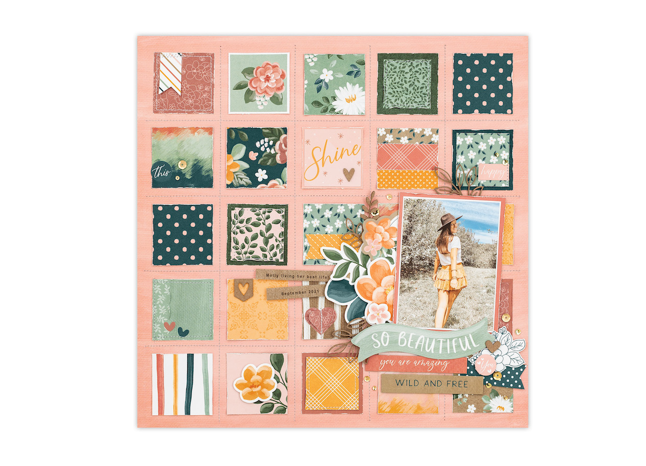
About a week ago Close To My Heart shared a blog post about how to duplicate techniques you see. They broke down the techniques they used on the cover of the *NEW* May-June Catalog. It’s interesting to get a look behind it all. I wanted to share it with you today to give you a little inspiration for you to utilize on a future project of your own.
It’s officially May, and that means there’s a new Close To My Heart catalog to gush over! Make sure to visit our website to see all of the new papers, stamp sets, dies—and more!—that we have to offer, now and through June!
As you can imagine, so much goes into putting together these catalogs, especially the artwork that is designed and created from the featured products. Nearly every page displays a beautiful scrapbook layout or set of cards offering more than meets the eye at a quick glance.
Today we’re taking a deep dive into the scrapbook page on the cover of the May–June catalog and closely examining some of the elements and techniques that were used to bring it all together.
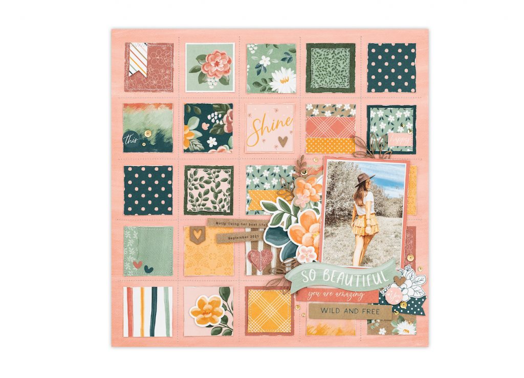
One of the first things you will notice on this page is the background. We’ve talked about repeating shapes to create a background before, in Creating an Intricate Scrapbook Page Is Easier than You Think! In that previous post, we mentioned that replicating one shape is not only a quick way to create a background but it’s also a great way to incorporate many different patterns and colors, so you can use as many of your favorite pattern paper designs without having to choose! (There are just so many pretty papers!)
In this case, a background made up of squares is a little extra special. Because the base page is also a square (12″ x 12″), we are repeating the shape again by filling it with the smaller 1⅞” squares. Even though it is the same shape, this approach is not only visually satisfying but visually exciting, as well, because the recurrence is with a variety of patterned papers and colors.
Can you find any other ways that we’ve used squares on this page?
If you said stitching, then you are right! When creating your art, consider lines, patterns, and shapes, as well as mixing media. A few stitched lines can quickly elevate a scrapbook page or card. If you’re not good with a sewing machine, you can easily draw “stitch” lines with a pen! (The number of rows and columns of background squares is also squared, 5 by 5!)
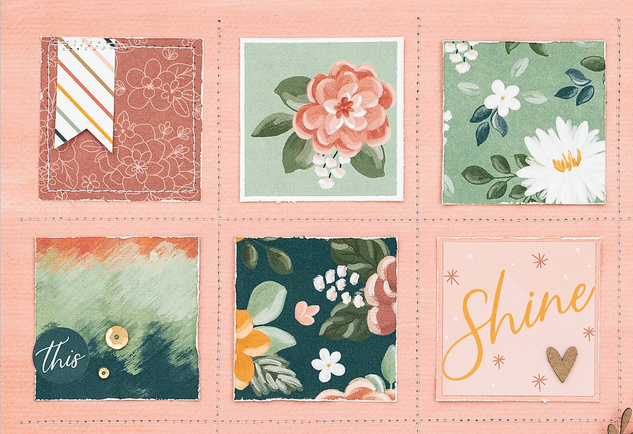
To create additional interest in our repetitive background, we also distressed our papers. Paper distressing happens when you alter the color or texture of the paper to produce a similar effect to it having been weathered by exposure to the elements over time. This real, authentic distressing (versus faux) is very popular and trendy, especially paired with the gorgeous patterns and colors from our Hope & Kindness collection. An easy way to distress the edges of your papers is running one blade of your scissors along the edges until the desired effect is achieved.
Now that we’ve got our background covered, let’s jump up to the next layer, and that’s the cluster of stickers and die-cuts we created for our photo. We know that the star of a good scrapbook layout is the story that it tells, whether it’s through photos, journaling, or a combination of both. For our already busy page, we needed to create a space that would draw and center our focus. This space is where we eventually want the photo and story.
Not wanting to cover up too much of the gorgeous background we created, we knew that we had to place our photo somewhere off-center, so we chose the bottom right. (We’ve been trained for things to resolve in the bottom and to the right, so if you’re ever in doubt, go for the bottom right!)
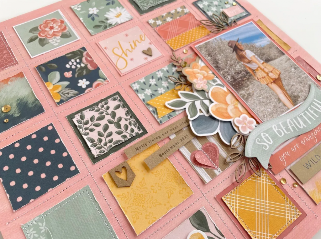
To begin creating the visual pull, we clustered several stickers and die-cuts just to the left of that space. Even though it may not look intentional, the way we placed and chose the pieces were very much so. For example, notice that we used three chipboard die-cut leaf stems. If you remember this simple rule when it comes to embellishments, you’re already ahead of the game: using an odd number of elements creates more dynamic art. This is known as the rule of odds.
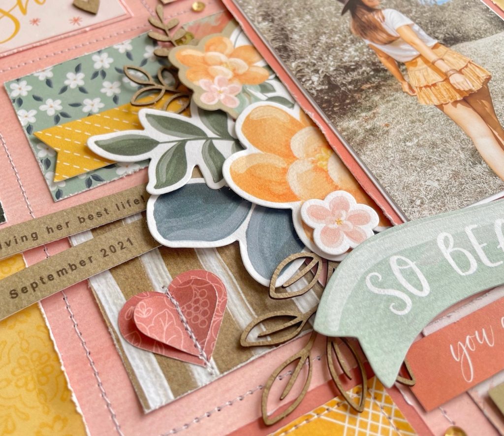
Also, as you create a cluster of embellishments, keep it interesting by incorporating different sizes, shapes, and materials. Add even more interest to the grouping by popping a few of these elements off the page with some foam tape. If you look closely, you can see that in our cluster we only used foam tape on the left side of the stickers, creating another visual arrow towards where the photo will be with a downward slope.
Lastly, let’s quickly discuss the photo. Our cluster was ready, but our photo needed something more before it could be attached to the page. That “something more” was a photo mat. The purpose of the photo mat on a layout like this is to provide your eyes with a place to rest once they’ve arrived to where we’ve been pointing towards all along. That is why the mat on this photo is a solid-colored cardstock rather than patterned paper. It provides your eyes with a visual break from all of the excitement happening on the rest of the page.
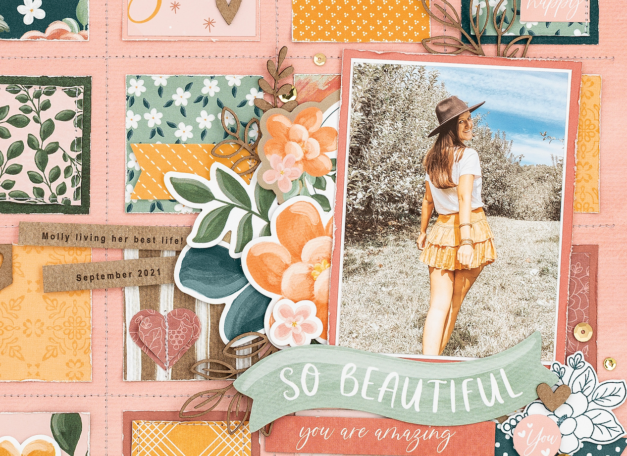
You may have noticed that we also layered an additional White Daisy cardstock mat between the photo and the Papaya cardstock. This extra layer created the small white border that highlights our destination even more. White was a good choice because it’s a neutral bright color that is in the photo and in several of the patterns of the papers and stickers.
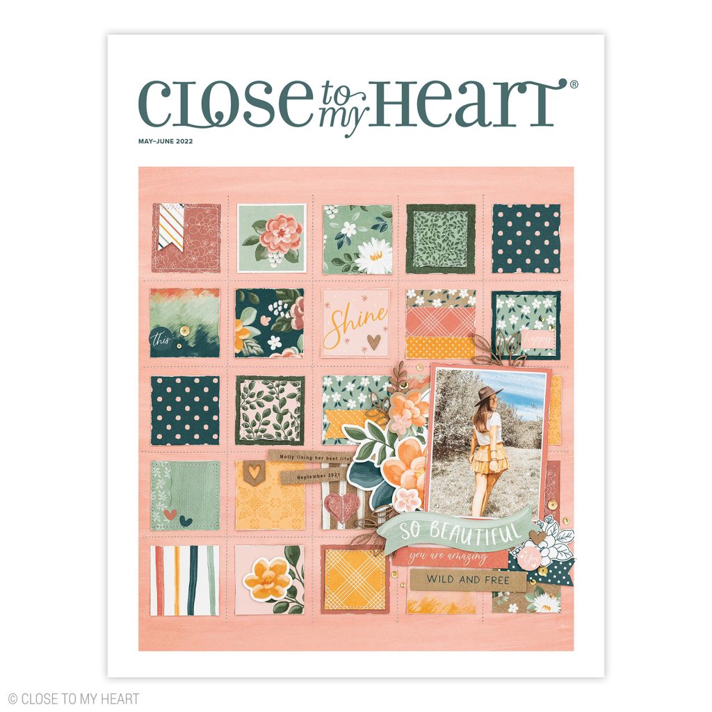
When you’re looking through any of our catalogs, we hope that you will discover lots of new concepts and ideas illustrated in the featured art. Taking a good look at the provided artwork examples is bound to reveal creative techniques or unique approaches to using a product. When you see a piece that stands out to you, flag it to return to later when you are ready to try it out for yourself. Our catalogs are so much more than product brochures, and we hope that you’ll use them as the full resource that they are and can be!
Did you learn a new trick or two? Hearing the thought process behind why something is done the way it is, is always so interesting to me. It helps give you insight as well as inspiration for your own projects. Additionally, it should guide you on how to duplicate techniques you see in the future.

