A few weeks back, Close To My Heart did a blog post about color and how to create perfectly balanced color combinations. As a papercrafter, choosing color combinations is a big part of each project we create. So it only seems fitting that I share this information with you in case you missed it. It all begins with our Love of Color.
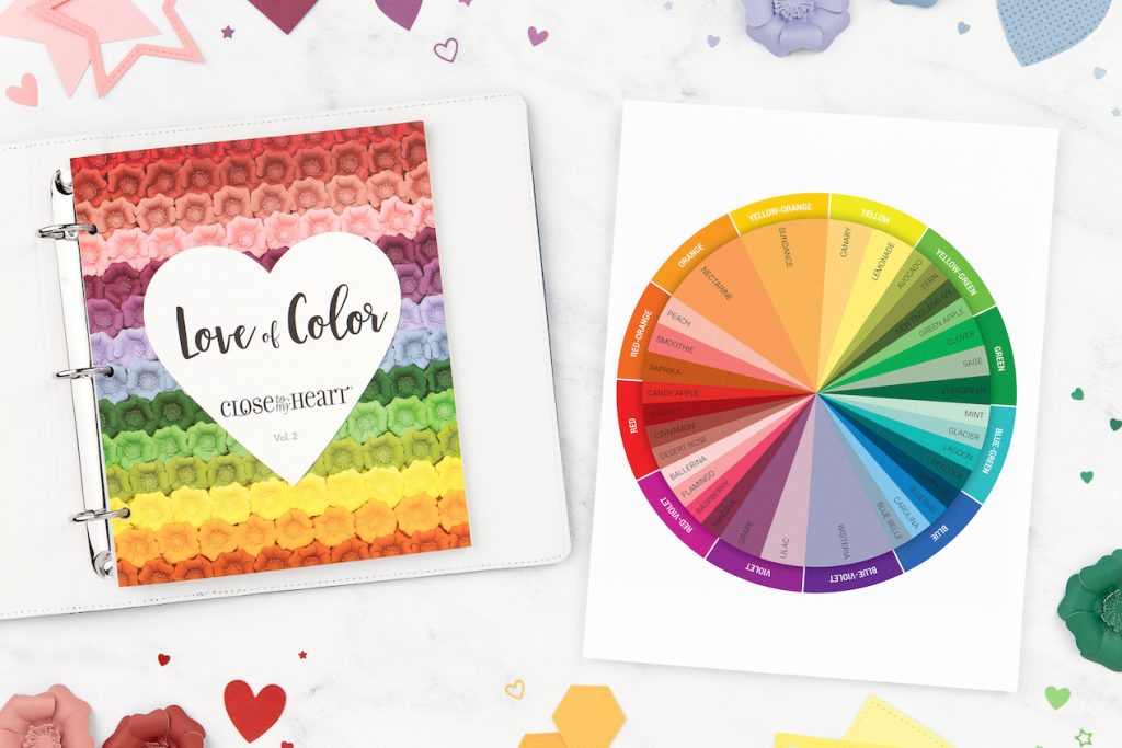
It’s no secret that we love color at Close To My Heart. Color breathes life and feeling into the world around us. With an unspoken language all its own, color has the power to calm, to energize, and to inspire. As spring slowly creeps its way into this year, the world is brightening up its color palette bringing with it a rejuvenation we all could use right about now—and we are all for it!
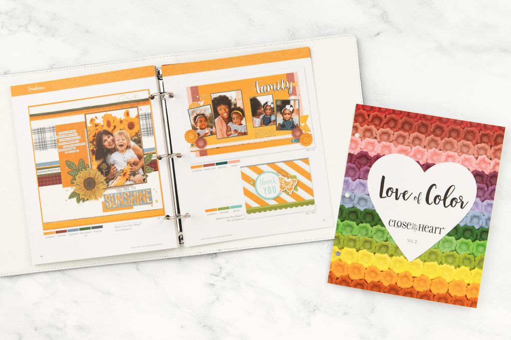
We are starting today’s color celebration with our Love of Color how-to series. Through its pages, the exclusive Close To My Heart color palette, made up of 44 unique colors, comes to life. Breathtaking artwork illustrates how to create perfectly balanced color combinations without any guesswork. Each spread in these volumes starts out with one exclusive color that is then combined with two, three, and four other exclusive colors, shown in beautifully crafted inspirational artwork.
Since we hope for sunny days in the upcoming season, let’s take a closer look at the color combinations offered for Sundance, one of our newer colors, in Love of Color Vol. 2, pages 26 and 27.
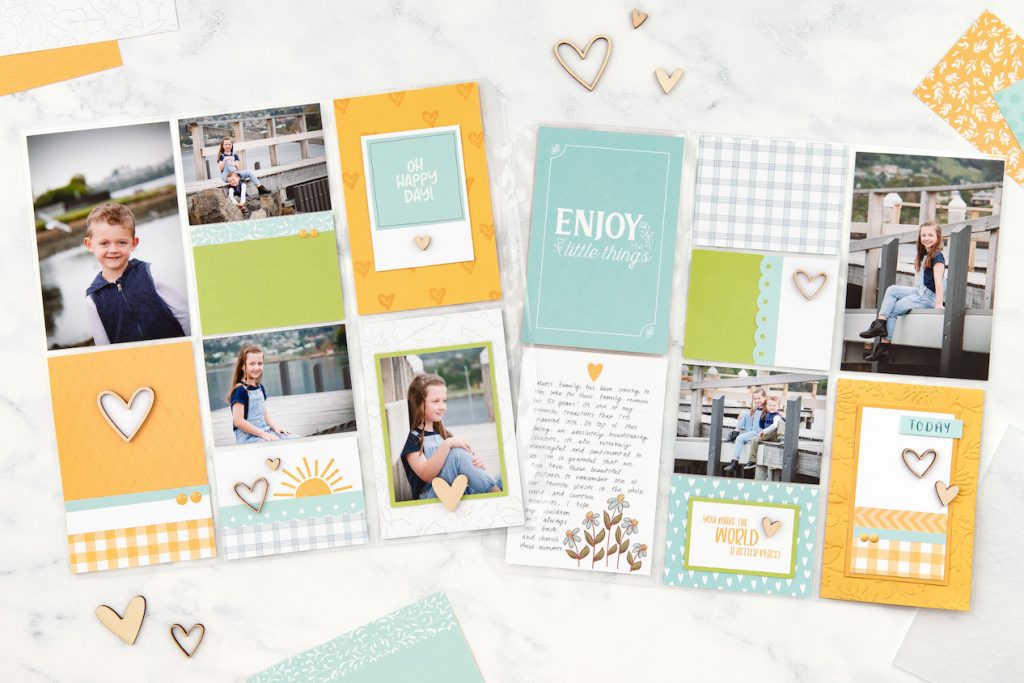
In this example, Sundance was paired with Avocado and Glacier. Sundance is the dominant color, and the others were used to complement it and to create accents throughout. (White is a neutral and doesn’t really count, so feel free to include as much or as little as you’d like!)
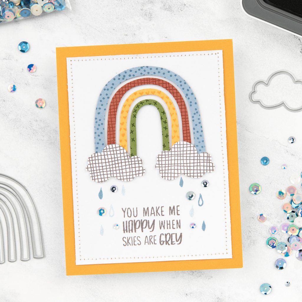
This perfectly spring-themed card was created by following another color combination featured in the guide, combining Sundance with Cinnamon, Blue Belle, New England Ivy, and Charcoal.
The third color mashup for Sundance in our Love of Color Vol. 2 includes pairing it with Peach, Desert Rose, and Peacock.
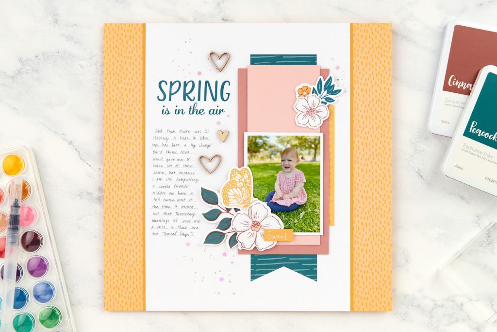
These inspirational color guides really make it so simple to combine colors that some of us probably wouldn’t even consider. Its pages explore the unique qualities of each color and help you see their beauty and versatility.
We’ve also talked about color theory on this blog, before. If you’re interested in creating your own color combinations, we encourage you to revisit those posts for a quick refresher on techniques for pairing colors. (Find links below.) Once you’ve got those basic rules down, we also encourage you to break them as you see fit!
To continue this colorful celebration, we’ve updated our Close To My Heart color wheel by removing the colors that retired from our palette just a few short months ago and adding the new colors that were introduced.
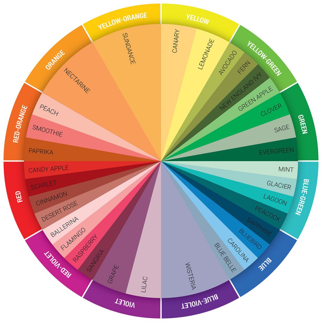
Download the updated Close To My Heart color wheel, here.
***Keep in mind that our exclusive colors are made up of much more complex tones, shades, and hues than how they are categorized on the simplified color wheel offered above. As you reference and use this source, know that it is not 100% confining. Especially as you become more familiar with what makes colors work together visually, you’ll find that this color wheel is very flexible.***
Lastly, we have a couple of bonus downloads for you today! Working with our amazing art studio, we put together two watercolor guides featuring techniques, tips, and all-around useful information—one for watercolor paints and another for watercolor pencils. In these guides you will find how to blend our exclusive colors using watercolor paints, the variety of ways a watercolor pencil can be used, and so much more! Enjoy exploring these watercolor guides, below!
Were you aware you can achieve our exclusive colors by using our watercolor paints and watercolor pencils? So fun, right? If you haven’t tried it yet, give it a go. That’s one of the things that initially attracted me to CTMH (and still does!) You know that you can coordinate items and not have to worry the colors will clash. From papers to ink and embellishments–they all coordinate. If you use Flamingo Cardstock, you know that the Flamingo ink will match it. As will accessories in the Flamingo color. It makes things look beautiful with very little effort!
And how about our Love of Color? Did you previously know about our color guides Love of Color? If not, they are definitely worth checking out. In addition to using the color combinations in our themed paper collections, these books are the next best resource. They prove so helpful. As you saw above, you simply start with one color and then branch out from there depending on how many colors you want to pair with it. These guides definitely help show you how to create perfectly balanced color combinations.

