I’m currently working on my video for this week…I’m focusing on Studio J. If you haven’t heard of it or used it yet, it’s CTMH‘s solution to the “I have too many photos” syndrome. It’s also a *NEW* way to think about digital scrapbooking–we call it studio scrapbooking.
While doing the video I realized I had done a couple “tricks” on my layout that you may not think to do. So I thought I’d share them with you today.
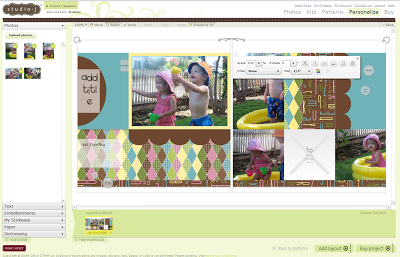
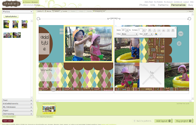
Here is my layout where I’ve started inserting my photos into the photo wells (see how they have those sections marked with an “X”…simply drag your photo from the upper left corner into the photo well and it’ll adjust the photo to fit!) You’ll notice that my darlings are looking out of the layout in the left hand page of my layout. Well, I’d like them to be looking into it to keep the movement on my layout so there is button in the floating menu bar that you can flip/rotate your photo.
Crazy, right?! When I first learned of this, I have to admit, I was a little unsure of this feature…it seems like cheating, right? But it really can serve a great purpose. This layout is the perfect example. It keeps your eyes moving within the layout rather than right out of it if I used the original photo orientation.
My second trick (and tip for today) is have you ever liked a pattern of paper but wished it was in a different color to suite your photos? Well, you’re in luck! You can click on any of the patterns and a color wheel will pop up giving you both the suggested color palette of your layout and also our entire line of colors. Simple click on the color you’d like and it will change the color but leave the pattern. How cool is that?
Be sure to stop back tomorrow for my video this week which will showcase the ease of Studio J. You won’t want to miss it!


